Challenge
Translate a mid-core arcade language into something clearer for hybrid-casual behavior.
UX/UI for Games
This case study adapts the original Medium article into a site-native format focused on the UX/UI angle: how a familiar arcade genre was reframed for mobile players who want immediacy, confidence, and visible progress from the very first session.
Translate a mid-core arcade language into something clearer for hybrid-casual behavior.
A more accessible, engaging, and monetizable framing for a classic shmup structure.
Context
Shmups never really disappeared. What changed was the kind of player dominating mobile. The core appeal of the genre was still there, but its language had drifted away from people who expect to understand quickly and decide even faster.
For a hybrid-casual audience, the problem was not challenge by itself. The problem was friction: too much interpretation, too much hesitation, too much effort before the loop starts feeling rewarding.
That gap created the opportunity. There was already a functioning genre and already a large audience. What was missing was the bridge between them.
Audience Insight
The intended player still wants stimulation, action, and a sense of progression. What they reject is the feeling of being pushed into a system before the experience has earned their trust.
That changed the design lens. Instead of asking how to simplify the genre, the better question became: how do we organize it so the player can stay in motion while the game explains itself through play?
Design Response
Early interactions, choices, and rewards needed to be obvious enough that the player could build momentum without studying the interface.
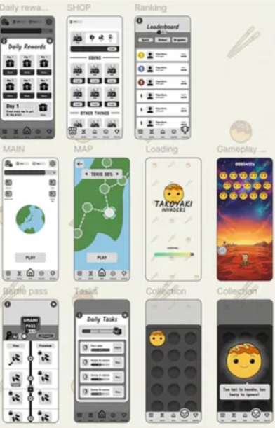
Menus and systems were still allowed to exist, but they could no longer arrive all at once or compete for attention during the core loop.
In an action game like this, flow is part of the fantasy. Any UX/UI decision that interrupted tempo had to be redesigned or repositioned.
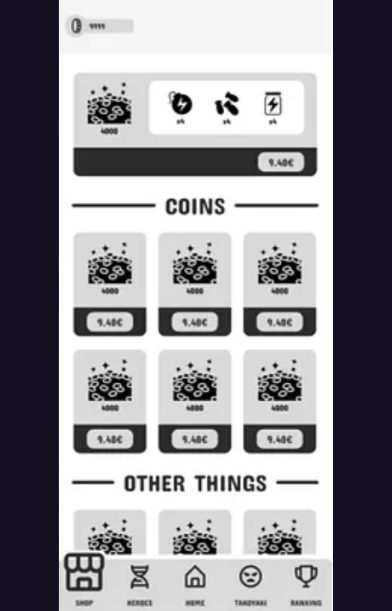
Revenue opportunities had to feel visible and intentional, but never like a punishment for staying engaged. The right tone was optional, readable, and fair.
How It Was Framed
The design target was defined around how hybrid-casual players commit, bounce, and interpret progress.
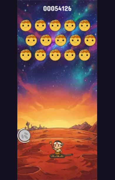
The mutant takoyaki kaiju direction stayed playful, strange, and memorable. The role of UX/UI was to make that tone readable, not sand it down.
The flow was organized so players stayed closer to the action while systems revealed themselves in the right order.
Monetization touchpoints were framed as part of the session logic instead of sudden interruptions competing with the loop.
Visual Notes
Outcome
The most important change was not cosmetic. It was about turning a genre that can feel demanding and niche into something that welcomes the player faster without pretending depth is a problem.
That is the value of UX/UI in this kind of project: not just cleaner screens, but a better conversation between what the game wants to be and how the player is ready to receive it.
If you want to compare this site version with the original published text, the source article is available on Medium.
Next Step